
 August 30, 2007
Here are a few charts from the California Healthcare Foundation 2007 report on healthcare costs. They show some interesting data.
This first one shows annual out-of-pocket spending by consumers on healthcare. As you would expect, it has gone up in real dollars, but it has gone down as a percentage. 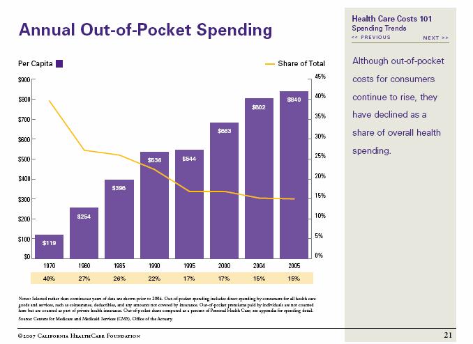
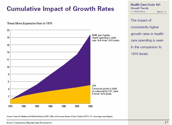
Here is a chart that shows how the yearly growth in healthcare costs has compounded itself over time compared to the CPI.
This next chart has always been interesting to me. When I was at the PBM, we talked so much about drug costs, but the reality is that they are a minority of the total costs.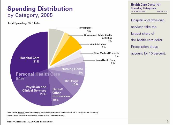
This chart comparing our spending to other countries is always a little scary since our average age and (I believe) our typical outcomes aren’t very different from these other countries. But, it is important to look at both together. Spending more if it made us live longer and healthier lives might be worth it.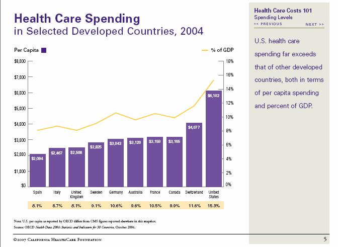
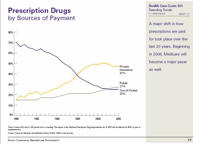
We used this chart several times in my past. It shows how private insurance has begun to pay for drugs compared with consumers over time.


No comments yet... Be the first to leave a reply!