
 August 30, 2007
I remember when I graduated from business school one of my professors gave me a book on data visualization. Given my architecture background, I always felt very strongly about this way of delivering information.
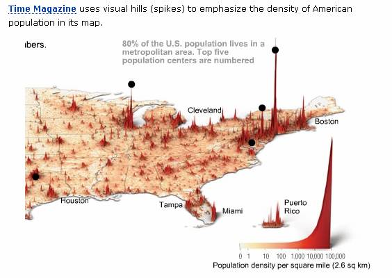
Guy Kawasaki mentioned a site in his blog which lays some of these visualization techniques out. Here is the site. There are some interesting examples which are well enabled by technology. Here is one of my favorite. I can easily image using this to map healthcare trends based on geography (for example).


No comments yet... Be the first to leave a reply!