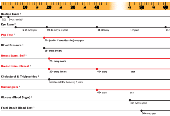
Richard Saul Wurman has been publishing for years and done many interesting things. I just stumbled upon his Understanding Healthcare site today. It is worth a visit. You could get lost in it, but it has lots of great examples about how to frame healthcare issues visually. I took a few screenshots below to get you interested.
One shows the top 10 causes of death in the US (note all this is a few years old) by age. Very easy to understand the data this way. One shows the tests that you need by age. (I could use this now.) The other is just representation of some data around caregivers.

 October 30, 2007


Neat. Would be interesting to see the same stats (especially cause of death data) compared to other countries.