
 October 16, 2012
I was just watching the Verizon advertisement where they show data in a few ways. While their charts are all basically the same, it made me think about different ways of representing the same data. We all know that this is an important thing as we evaluate the effectiveness of different programs.
Let me highlight four different ways of representing two data elements. In this case, I’m comparing two programs. The first program (A) had a yield of 20% and the second program (B) had a yield of 23%.
- I could say that Program B was 3 percentage points better than Program A.
- I could say that Program B was 15% better than Program A.
I could show the data in two different charts where I simply change the y-axis.

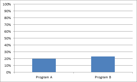


The key is to make sure it is clear what the y-axis represents – percent change or absolute change.